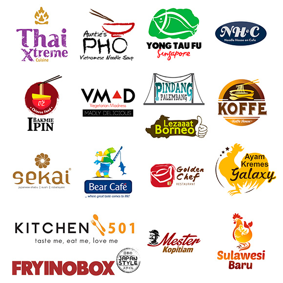
Design Logo Restaurant

Designing logo for restaurant need a special skill, it’s unique and different compare to design logo for a company. Design logo for restaurant need to consider color. The color usage is managed carefully, Using the right color to represent the restaurant is crucial. The logo has to describe the restaurant uniqueness, what they sell, what is the restaurant is all about and what is the class of the restaurant as well the personality and the meaning of it. It is a complicated matter since it is so subjective to the owner point of view as well its also an art of look balance, look good as well.
Design Logo Restaurant, right one for your business
Color in design logo restaurant
Red is for hot item? or red is for Grill? or Green is for fresh vegetable? how about yellow? is it for bread? brown for bread also? well its always debatable issue. Color for Restaurant is rather sensitive, a grill restaurant using a blue domination in their logo, and a bakery shop using purple color, a Sundanese restaurant having red and yellow as their logo. well much we can say it is not a fixed rule, rather we say it is a custom for every nation, culture and part of the culture. However the right color for design logo restaurant is more meaning full than designing a corporate logo.
How about Font? yes font is very very crucial, it is saint for design logo restaurant
Font takes 60% of the logo essential. It is what people read and call. The type of font determine the feel and mood of the entire perception of the restaurant. It’s show energy as well emotion and definitely a branding component. Design logo Restaurant is collaboration of font size, type of font, where it placed and play of color.
for your design logo restaurant please consult us more detail by calling or contact us
pid design logo restaurant:
- Golden Chef Restaurant
- Yong Tau Fu Singapore
- Ayam Kremes Galaxy
- Bakmi Ipin
- Sekai
- Fry In O Box
- NheC
- Aunty Pho
- Jumbo, Dapoer Item, Boogie
- Nom Nom Resto
Desain Logo Restoran
Desain logo restoran, memiliki keunikan tersendiri berbeda dengan desain logo perusahaan. Logo untuk restoran harus memperhatikan warna. Warna yang dipergunakan tidak asal pakai. hasil desain juga harus membuat pengamat langsung mengerti apa yang dimaksud. Selain warna, bentuk dan typography yang dipergunakan juga harus mendukung aura dari restoran. Keserasian antara warna, bentuk, ketebalan garis, typography juga sangat penting supaya memenuhi unsur keseimbangan. Ada beberapa hal yang harus diperhatikan dalam menciptakan logo: keserasian, warna, feel-aura, daya tarik, kekontrasan antara siang dan malam, tingkat perhatian dan tentunya looks representative dengan citra-brand restoran Anda.
Untuk Icon, seperti icon pedas, panas, chef recommendation, customer’s favorite, most wanted, refreshing, new, improved, favorite…
Pid dengan tim desainnya telah menciptakan berbagai logo, product logo, icon. Kami tidak sekedar mengerti, kami memahami logo
hubungi kami untuk logo restoran Anda di info@pidpid.com
